How Do I Use AI for Data Analysis Without Being a Developer?
If you have ever stared at a 348-row CSV and thought “there’s a story in here, but I’d need a data scientist to find it” — this article is for you.
I am a researcher, not an engineer. Over the past months I ran a full exploratory factor analysis on 348 clients: PROMAX rotation, KMO checks, scree plots, hierarchical factor structures, cluster optimization, and 9 detailed micro-segments. The pipeline produced publication-quality charts, executive reports, and lead-matching rules.
I wrote almost none of the code myself. I ran the entire analysis through Claude Code — the terminal-based AI assistant from Anthropic — while talking to it the same way I would brief a junior analyst.
Here is how, what worked, what did not, and what I would tell a colleague starting their first AI-assisted study tomorrow.
What I was trying to do
The project sounds simple in one sentence: identify the behavioral dimensions that separate high-performing clients from average ones, and turn the answer into something operational — segments, microprofiles, and rules for matching leads to the right client.
In practice, “operational” was where the real difficulty lived. A factor structure on its own is academic. Leadership did not want a paper — they wanted to know, for each lead that walked in tomorrow morning, which segment that person belonged to, what their dominant behavioral profile was, and which advisor on the team was the right match. That meant the analysis had to produce not just numbers, but decision rules non-analysts could apply on a Monday.
The data: a 348-respondent survey with dozens of Likert items, behavioral statements, and demographic variables. Some scales were validated, others were custom-written for the study. About a third of items had reverse coding. Missingness was uneven across blocks. There were enough small data-quality issues that I knew, going in, I would spend at least a third of the engagement on cleaning rather than modeling.
The output a non-technical reader would expect:
- a clean factor structure (we landed on 12 factors, KMO = 0.883, 66.1% variance explained)
- 5 strategic segments broken into 9 operational microprofiles
- visualizations a manager can read in 10 seconds
- a recommendation deck for the leadership team
- a one-page lead-matching guide the sales team could actually use
If any one of those failed, the whole study failed. A beautiful factor solution that does not turn into a usable deck is just expensive housekeeping.
Why ChatGPT alone was not enough
Most people start with ChatGPT — paste in a CSV, ask “find segments in this data”, and hope for the best. I had done this on smaller studies. It works in a particular way: you get a confident, plausible-sounding answer back, you do not really understand what was run under the hood, and you have no way to reproduce it next month when leadership asks the follow-up question.
For a one-off curiosity question, that is fine. For a study you are going to defend to a research committee, present to a board, and operationalize across a sales team — it falls apart on several fronts at once:
- No persistent state between prompts. Every conversation starts from scratch. By prompt fifteen you are re-explaining the coding scheme you already explained three times. By prompt thirty you have lost track of which version of the cleaned data you are even working with.
- No real file access. You keep re-uploading the same CSV. You cannot say “use the cleaned file I saved last Tuesday” because last Tuesday’s file does not exist in the chat.
- A limited execution environment. The Python sandboxes time out on anything moderately intensive, the package list is fixed, you cannot pip-install the factor analysis library you actually want, and large plots silently get downsampled.
- No version of “show me the file you just wrote.” Outputs live in the chat window, not on disk. If you want to email the chart to a colleague, you screenshot it.
- No memory of methodological decisions. If you spent four exchanges talking through why PROMAX is better than VARIMAX for this dataset, that reasoning evaporates the next session.
Real data analysis is iterative in a way these constraints actively fight. You run a model, look at the residuals, re-spec, re-run. You version your scripts. You keep intermediate outputs around. You compare today’s solution to yesterday’s. ChatGPT was never designed for that — it is a chat interface, and analysis is not a chat.
Why Claude Code worked
Claude Code runs in your terminal, in your project folder, on your real files. The framing shift is small to describe and large to live with: it is not a chat about your data, it is an agent in your data.
Concretely, it:
- reads and writes files directly on disk, so the cleaned dataset, the factor loadings table, and the executive summary all exist as real files I can open, share, version, and email
- runs Python, R, or shell scripts and reads back the output, so it can actually see what its own code did and respond to it instead of inventing what it thinks happened
- iterates without me copy-pasting code between windows, which sounds like a quality-of-life improvement and is actually a discipline upgrade — fewer copy-paste errors and fewer “wait, did I save that version?” moments
- keeps a coherent thread of context across the whole project, including any markdown notes I left for myself
- generates charts that I can open in Preview, inspect, and ask it to restyle in plain language (“the F4 axis label is overlapping with the gridline — move it outward by 10%”)
For a non-developer, this changes the experience completely. Instead of “give me code I will try to run”, it becomes “here is my data folder — run the EFA, save the scree plot, and write a five-paragraph summary in plain language for the executive deck.”
That is a sentence I actually typed. The result is a .md file in the project, ready to share. The factor loadings table is a real CSV I can paste into the appendix. The scree plot is a PNG I can drop into the deck. None of it lives trapped inside a chat.
Setting up the project before the AI does anything
The single biggest improvement in my workflow had nothing to do with prompting. It was the boring, pre-AI step of putting the project folder in good shape before opening Claude Code. The shape I now use:
data/— raw inputs, untoucheddata/cleaned/— output of the cleaning passes, with a dated suffixnotebooks/— exploratory analysis filesoutputs/charts/— every chart the project producesoutputs/reports/— narrative markdown filescoding_variables.md— the human-readable codebook explaining every column, scale, and reverse-coded itemREADME.md— one paragraph describing what this project is and who it is for
I learned the hard way that the AI’s output quality is roughly a function of how much context it can pick up by simply reading the folder. The first time I ran this kind of study, my folder was a heap of Untitled.xlsx and final_v3_REAL.csv files. The AI dutifully produced mediocre work because the inputs were a mess. The second time, I spent an hour writing a proper codebook before I even started. Everything downstream — model selection, cluster naming, the narrative — got dramatically better.
The lesson generalizes: the prompt is not the bottleneck. The setup is.
A concrete workflow I now reuse
For every data project, I follow roughly the same path with Claude Code. The discipline is more important than the cleverness — I rarely deviate.
1. Set the scene in plain language
Open Claude Code in the project folder. The first message is not code. It is context:
“We have 348 client responses in
clients_survey.csv. The goal is to find behavioral dimensions and cluster clients into operational segments. I want to publish in an executive deck for the leadership team. Start by reading the coding scheme incoding_variables.mdand tell me back, in your own words, what you think the study is about. If anything in the codebook is unclear or contradictory, flag it before we begin.”
That last sentence has saved me hours. Roughly one project in three, the AI comes back with a question I did not expect — a duplicated variable name, an ambiguous Likert anchor, a scale that flips direction halfway through — and I get to fix it before the analysis is contaminated by it.
This is the most underrated step. AI without context produces generic output. AI with crisp context produces your analysis.
2. Ask for descriptive analysis first, not models
The temptation is to leap straight to clustering. Resist it.
“Before any factor analysis, give me a one-page descriptive: distributions, missingness, Likert-scale ceilings, top five surprising patterns. Save the chart panel as
outputs/charts/01_descriptives.pngand the narrative asoutputs/reports/01_descriptives.md.”
The output is not just code — it is a saved markdown file, with the chart panel referenced, and the data cleaned. From there I decide what is worth modeling. In this study, descriptives told me that two of my candidate “barrier” items had ceiling effects (over 80% of respondents picked the top anchor) and were going to add noise rather than signal to the factor analysis. I dropped them before running EFA. That single decision, made on the basis of a five-minute descriptive pass, almost certainly improved the final structure more than any modeling choice I made later.
3. Push the model selection back at the AI
“We have ~40 Likert items. Recommend a factor structure approach (EFA vs CFA, rotation, criteria), then run it. Show me the KMO, the Bartlett test, the scree plot, and the parallel analysis. Save them in
outputs/charts/. Then commit to a number of factors and explain why.”
I do not pick the methodology blind. I ask Claude Code to justify the choice, then push back if I disagree. In this study we ended up on PROMAX rotation (correlated factors are realistic for behavioral data), with KMO = 0.883 and 66.1% variance explained across 12 factors.
The “commit to a number and explain why” framing matters. Without it, the AI will happily give you three plausible factor solutions and let you pick — which sounds helpful but is actually the AI offloading the methodological decision back onto you. I want it to take a position. I am allowed to disagree, but I want a position to disagree with.
4. Demand the visual layer
This is where Claude Code really shines: it does not just describe results — it draws them, saves them, and lets me critique them as files.
In one project session, Claude Code generated:
- a scree plot to confirm the 12-factor solution
- a hierarchical factor structure diagram showing the second-order factors above the primary ones
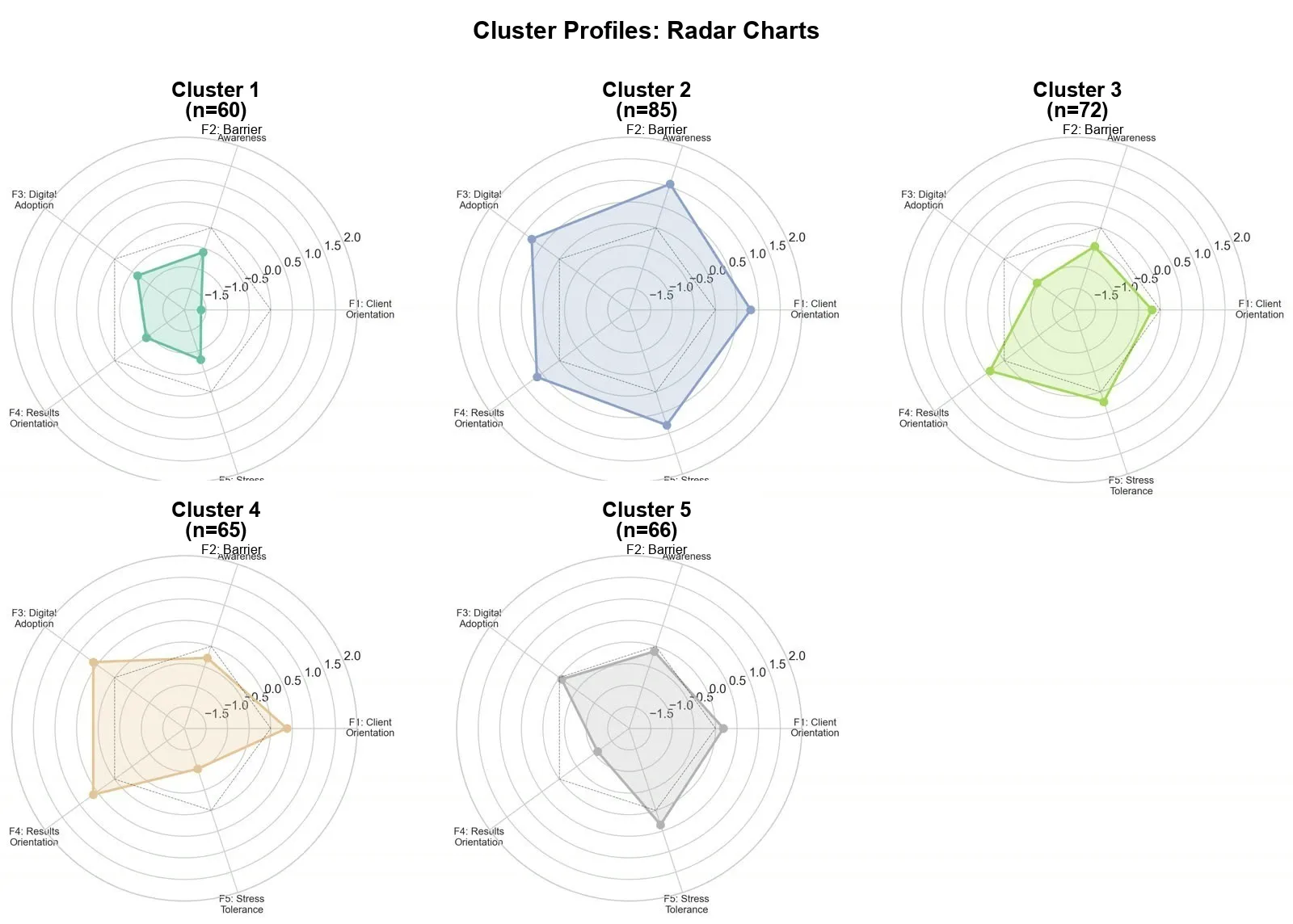
- the cluster radar chart at the top of this article, comparing the five segments across behavioral dimensions
- a correlation heatmap at SPSS quality, with significance asterisks
- segment-level bar and pie charts for income, gender, and age
- a one-page client persona sheet for each of the nine microprofiles, with the radar shape, the demographic summary, and a sample quote pulled from the open-ended responses
I review each chart, ask for restyling in plain language (axis labels in the right language, color palette consistent with the brand, a specific font size for axis ticks, no chartjunk on the gridlines), and iterate until they are presentation-ready. The fastest single iteration I logged was 45 seconds from “the title is too small” to a regenerated PNG sitting in the folder, ready to share.
5. Get the narrative for the deck
Charts are not insights. Insights are the sentences that go next to the charts.
“For each of the five segments, write a three-sentence executive description. Tone: confident, no jargon. End with one sales-management implication. Save in
outputs/reports/segments_narrative.md.”
Claude Code writes them. I edit. Both faster than from scratch. The edits are usually around one of two things: (a) softening over-confident phrasing — the AI tends to assert where I would hedge, and (b) replacing generic implications (“focus on personalisation”) with implications grounded in the actual data (“re-prioritise the 31-to-45 income bracket in outbound, where this segment over-indexes by 2.4x”).
I also routinely ask for the same narrative in a second register: a short version (one paragraph per segment, for the slide) and a long version (one page per segment, for the appendix). Two passes, one prompt apart.
Things I had to remember to do
A few small disciplines made the difference between an analysis I trusted and one I would have had to redo:
- Make the AI print its cleaning decisions. Every time it touched the data — dropped a row, imputed a value, recoded a Likert direction — I asked it to log the decision in
outputs/reports/cleaning_log.md. The log was the difference between a reproducible study and a black box. - Save raw outputs alongside cleaned ones. Never let the AI overwrite the raw file. Ever. I treat the raw CSV as if it were carved in stone.
- Date your output files.
01_descriptives.mdis fine.01_descriptives_2026-05-12.mdis better. By week three you will have re-run the descriptives four times with slightly different cleaning rules. Future-you will need to know which one fed the deck. - Re-read the codebook every week. The AI is very good at quietly forgetting which variables were reverse-coded once the conversation gets long. The human in the loop has to remember.
- Ask for unit tests on the cleaning code. Even if you cannot read the test code yourself, the AI will run it and tell you if anything failed. That single discipline caught two coding mistakes I would otherwise have shipped.
What did not work
A few honest limitations, especially for a researcher who cares about rigor:
- It will sometimes “make it work” silently. If a column has weird coding, it may impute or drop without asking. I now require it to print a summary of every cleaning decision and refuse to proceed if the summary is missing.
- It can over-recommend. Asked for “the best factor structure”, it sometimes proposes three options and lets me choose — I have to push it to commit to one with reasoning, then defend it against my pushback.
- It hallucinates citations. For the literature review section I never trust references it generates. I cross-check every DOI manually, and roughly one in three turns out to be confabulated — sometimes plausibly so, with real authors and real journals, but a paper that does not exist.
- It does not know your business. Cluster naming, segment labels, sales-management implications — these always need a human who lives in the domain. The AI’s first-pass cluster names tend to be either too generic (“Engaged Users”) or too literal (“High on F1, low on F3”). The names that actually stuck in the leadership meeting were ones I rewrote.
- It can be too confident with small samples. With n=348 split across five clusters, some segments have fewer than 60 respondents. The AI does not always volunteer that the confidence intervals on a 12-question subscale within a 54-person cluster are wide. I now ask for sample-size flags on every per-segment claim.
- Reproducibility takes effort. Out of the box, a Claude Code session is not a reproducible pipeline. If you want next month’s re-run to produce the same numbers, you have to ask it to write a script — and then run that script rather than re-prompting from scratch.
None of these are deal-breakers. All of them are reasons the human still matters.
What I would tell a colleague starting tomorrow
If you are a researcher about to run your first AI-assisted study, the advice I wish someone had given me on day one:
- Invest in the codebook. Spend two hours writing a clean, human-readable description of every variable before you ever open the AI. That document will pay for itself within the first session.
- Start small. Run the same workflow on a 50-row subset of your data first. If the workflow does not survive contact with 50 rows, it will not survive 350.
- Keep a prompt log. Every prompt that produced something genuinely useful, paste into a
prompts.mdfile. By the end of the project you will have a personal playbook you can lift onto the next study unchanged. - Ask the AI to grade itself. “On a scale of 1 to 5, how confident are you in this clustering, and what is the single biggest reason it could be wrong?” The answer is usually more useful than the underlying analysis.
- Do not skip the descriptive pass. I know. You want to cluster. Descriptive first.
- Defend, do not delegate. You are still the methodologist. The AI is the postdoc. The postdoc is brilliant and tireless and sometimes wrong.
The takeaway
You do not need to know Python to run a real factor analysis. You do need to know:
- what question you are actually answering
- what a clean factor structure should look like
- how to push back when the AI takes a shortcut
- where the human-in-the-loop decisions live and how to recognise them when they arrive
If you can brief a junior analyst, you can run a study with Claude Code. If you cannot — start there first, then sit down with the AI. No tool fixes a vague question.
For us, this turned what would have been a six-week analytics engagement into something I could iterate on daily, with a partner that is always available, never tired, and never offended when I scrap a model halfway through. The deliverables were better than the agency quote we had been considering. The team learned more, because the analysis was no longer a black box happening somewhere else. And we now have a reusable workflow that the next study can lean on instead of starting from zero.
That is the real prize. Not the one report — the muscle to run the next ten.
Want this workflow inside your team? Igodemy runs hands-on training on AI-assisted research and data analysis — from the first CSV to the executive deck. Talk to a Strategic Advisor →